

Last Monday, I launched a new version of the Asexuality flag [see below] on Substack, Instagram and Facebook. Let me tell you, the commentary has given me light whiplash! Many people were excited for this change and there were also folks who didn’t understand why this was happening in the first place. I’ve shared quite a bit more information regarding why i decided to move in this direction and a lot of that can be found below;
Clarity Around The New Ace Flag
Ace Flag Revision Survey [Final Data]
Did you know about the Ace Flag Colours?
For context, the conversation around this [for me] has been 3 years long. I don’t believe it’s fair for so many different communities of asexual people to be so divided on this topic when ‘A’ meaning ‘Asexual’ has been the basis of our literal identities being validated for decades across society. After several, several conversations and discussions, I moved towards change vs waiting. While this resigned came from me, the conversation was consistently communal. From that, this step forward came & below is the flag that I introduced on April 6. When I hosted the live on Instagram, I was able to get more feedback on the design as well as more insight on the meanings. I assigned to each color.
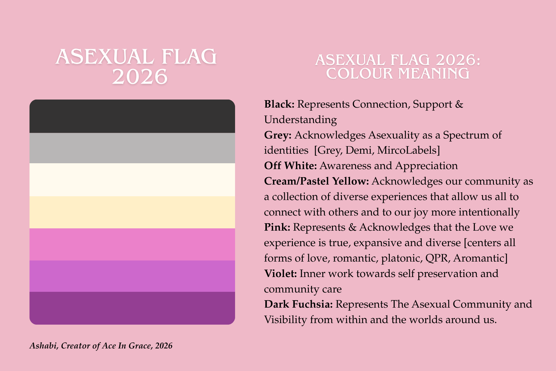
During the live, I hosted on Instagram, several community members pointed out that the colors may be too close together, and could be difficult for those who are visually impaired to see. Not only that we had conversations about including sexual intimacy into the flag as well as many other things. From this discussion, I redesigned the original flag launched and adjusted the meanings I had attached to them. The feedback shared was;
Minimizing the colors from 7 to 6; allowing this version of the flag to be easier reproduced and found when shared in Queer Spaces.
Highlighting non-other centered love within the asexual community.
Acknowledging that asexual people can also experience sexual intimacy & including this spectrum into this flag.
Brightening the colors of this flag so the Cream/White and Pastel Yellow stand out more.
Possibly combining the Violet and Dark Fuchsia/Purple line in the flag for visual ease.
From the feedback shared, below are the updates.
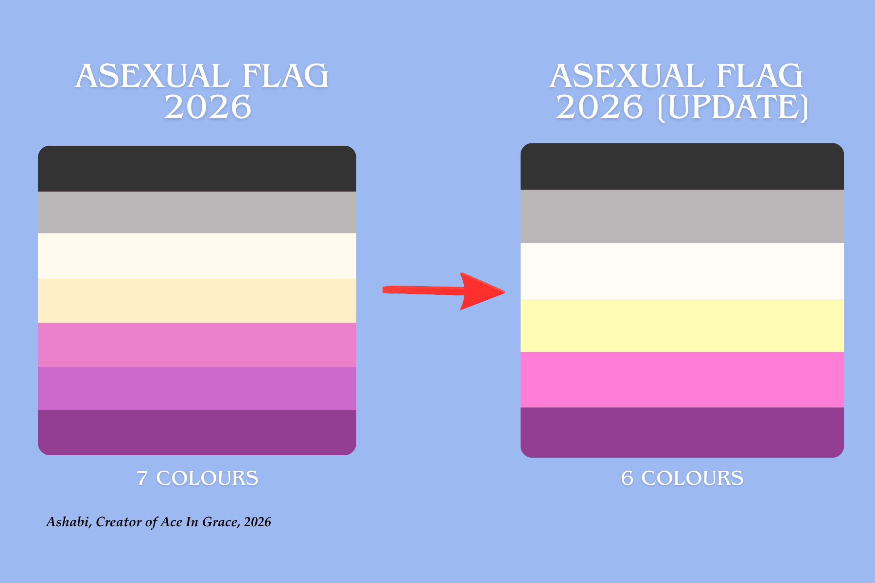
Reduction of lines from 7 to 6 Colours; Removing the Violet and leaving the Purple/Dark Fuchsia Colour in the flag.
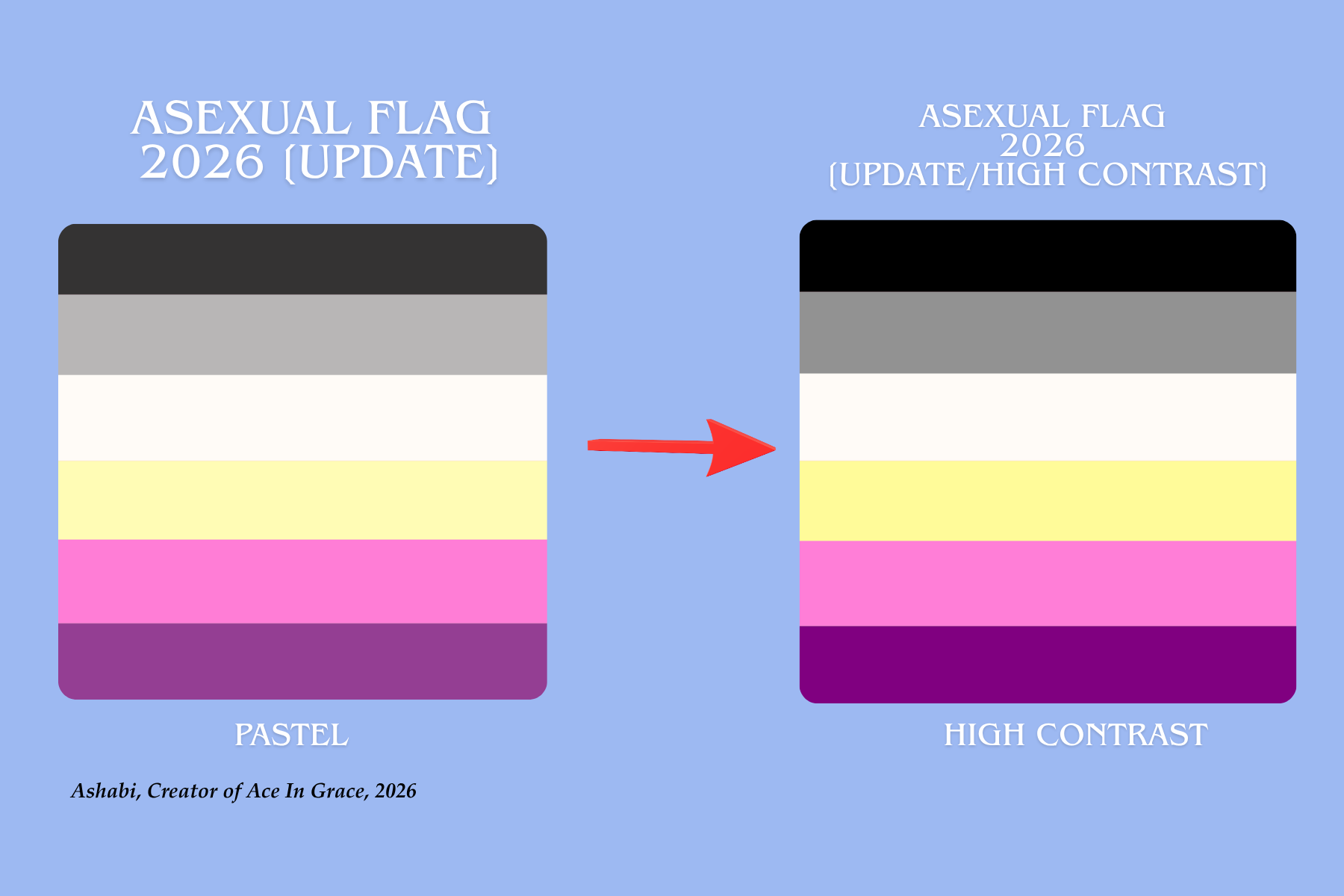
Strengthening the contrast of the colours; allowing them to stand out more and be better for those who are visually impaired.
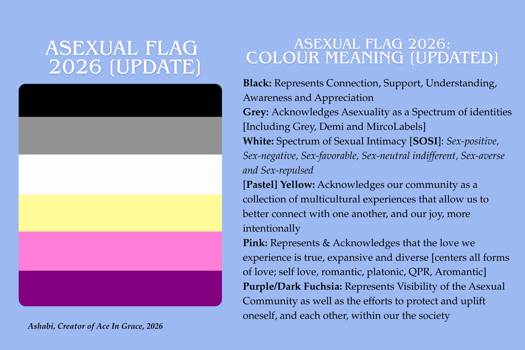
Adjusting the meanings of the colours in this flag to better represent several experiences in the Asexual Community;
Black: Represents Connection, Support, Understanding, Awareness and Appreciation
Grey: Acknowledges Asexuality as a Spectrum of identities [Including Grey, Demi and MircoLabels]
White: Spectrum of Sexual Intimacy [SOSI]: Sex-positive, Sex-negative, Sex-favorable, Sex-neutral indifferent, Sex-averse and Sex-repulsed
[Pastel] Yellow: Acknowledges our community as a collection of multicultural experiences that allow us to better connect with one another, and our joy, more intentionally
Pink: Represents & Acknowledges that the love we experience is true, expansive and diverse [centers all forms of love; self love, romantic, platonic, QPR, Aromantic]
Purple/Dark Fuchsia: Represents Visibility of the Asexual Community as well as the efforts to protect and uplift oneself, and each other, within our the society
To me, this redesign feels a lot better. No only do these colours pop more, the variations [pastel, neon, high contrast] can be explored with ease, but the meanings of these colours feel better aligned to many of our experiences as Asexual people!
But, that’s my opinion on the matter. What do you guys think about this? I would love to continue hearing from community about this and push this forward. I don’t see myself changing these colours again but I don’t doubt that folks will have thoughts about the meanings. With that, please share them!
As always, I appreciate all of you who’ve been a part of this amazing journey with me. I hope you guys continue to be here as this grows! Be sure to stay hydrated and snack when you can. I will be going live again on my Instagram this Sunday @ 8PM CST. Please join and let’s continue the conversation!
Later Ace Babes~
Ashabi
Honestly, I really like the new color meanings and the colors with the high contrast are really pretty. 🖤🩶🤍💛🩷💜 I identify really strongly with asexuality but I’ll admit I didn’t connect as much with the original flag itself because of the color meanings— I like the flag and it makes me happy to see because it represents a community I’m a part of but the color meanings just didn’t feel like it represented the experience enough to me so I personally welcome this change.
i actually really love this. always felt the ace flag was a bit drab, which is why i prefer the aroace one. you've managed to make it pretty while somehow keeping it recognisably ace. great work!